px to em converter
calculation below using the parent element's font size.
Comprehensive explanation of pixel px to em conversion.
Free online tool for CSS
px to em converter
calculation below using the parent element's font size.
Comprehensive explanation of pixel px to em conversion.
Description
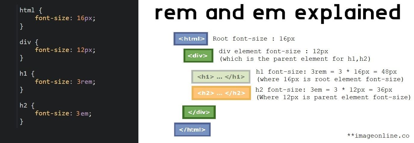
With CSS, "em" is a relative unit that is mostly used for font-size, meaning that its value is determined by the parent element's font size. The parent element's font size determines the sizes of all other child elements that use the em unit if it is specified. 1em is always equal to the current font-size of its parent, 0.5em would be half, and so on. The use of em units facilitates font size scaling and adjustment without compromising individual elements, thereby preserving a consistent user experience.
To convert pixel px to em, divide the px value of child element by the font-size of the parent element. For instance, if the parent element's font size is 16px and the child element's font size needs to be set to 10px then the corresponding em value of the child element is equal to (10/16) = 0.625 em. Our tool makes it simple to convert pixels px to em quickly.
What we do
Simply enter the font-size in px and the font-size of the parent element into the tool to convert px to em.
To convert px to em, this tool divides the px value by the parent element's font size.
Indeed, this tool allows you to convert px to em without any restrictions.
It is absolutely safe to use this px to em converter tool. All conversions with this browser-based tool take place in the user's browser.
Using this tool to convert pixels to em doesn't require any special knowledge. Simply enter the parent element's font size and font size in pixels into the tool to convert.
No prerequisites or limitations in this tool. You can easily convert px to em as frequently as you'd like.
Tools section